Skip to content

Button

Basics

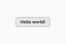
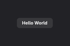
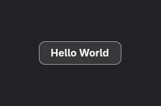
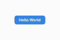
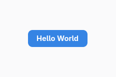
You can create a simple button :
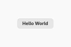
final var button = Button.withLabel("Hello world!");
val button = Button.withLabel("Hello world!");
Button {
  label: "Hello world!";
}
<object class="GtkButton">
  <property name="label">Hello world!</property>
</object>

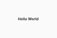
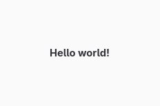
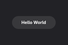
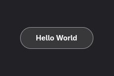
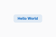
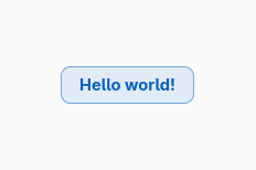
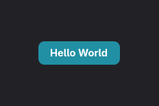
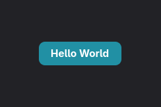
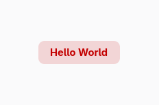
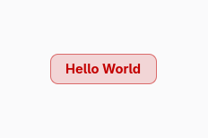
Screenshot of a flat button

Screenshot of a flat button

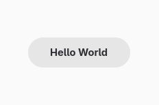
Screenshot of a flat button

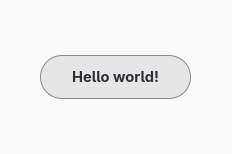
Screenshot of a flat button

Interaction

The main interaction with a button is clicking it. You handle this interaction by hooking to the clicked event :

button.onClicked(() -> {
    System.out.println("Hello world!");
});
button.onClicked {
    println("Hello world!")
}

Icon button

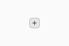
You can create a button with just an icon :
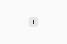
button.setIconName("list-add-symbolic");
button.iconName = "list-add-symbolic";
Button {
  icon-name: "list-add-symbolic"
}
<object class="GtkButton">
  <property name="icon-name">list-add-symbolic</property>
</object>

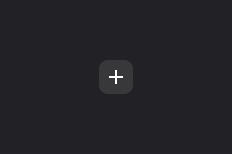
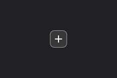
Screenshot of an icon button

Screenshot of an icon button

Screenshot of an icon button

Screenshot of an icon button

Icons

Refer to this page regarding available icons.

Appearance

CSS classes

There are several libAdwaita CSS classes enabling button styling.

Add a CSS class to a widget

button.setCssClasses(new String[]{ "flat" });
button.cssClasses = arrayOf("flat")
Button {
  label: "Hello world!";
  styles [
    "flat"
  ]
}
<object class="GtkButton">
  <style>
    <class name="flat"/>
  </style>
</object>
CSS class GNOME White GNOME White High Contrast GNOME Dark GNOME Dark Hight Contrast
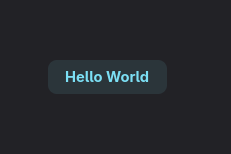
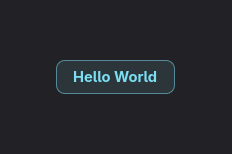
flat Screenshot of a flat button Screenshot of a flat button Screenshot of a flat button Screenshot of a flat button
pill Screenshot of a pill button Screenshot of a pill button Screenshot of a pill button Screenshot of a pill button
accent Screenshot of an accent button Screenshot of an accent button Screenshot of an accent button Screenshot of an accent button
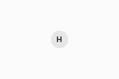
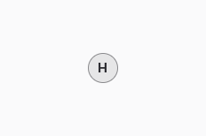
circular Screenshot of a circular button Screenshot of a circular button Screenshot of a circular button Screenshot of a circular button
suggested-action Screenshot of a suggested button Screenshot of a suggested button Screenshot of a suggested button Screenshot of a suggested button
destructive-action Screenshot of a destructive button Screenshot of a destructive button Screenshot of a destructive button Screenshot of a destructive button

Custom background & label color

References