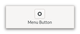
Class MenuButton
- All Implemented Interfaces:
Accessible,Buildable,ConstraintTarget,Proxy
This popup can be provided either as a GtkPopover or as an abstract
GMenuModel.
The GtkMenuButton widget can show either an icon (set with the
Gtk.MenuButton:icon-name property) or a label (set with the
Gtk.MenuButton:label property). If neither is explicitly set,
a Image is automatically created, using an arrow image oriented
according to Gtk.MenuButton:direction or the generic
“open-menu-symbolic” icon if the direction is not set.
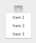
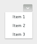
The positioning of the popup is determined by the
Gtk.MenuButton:direction property of the menu button.
For menus, the Gtk.Widget:halign and Gtk.Widget:valign
properties of the menu are also taken into account. For example, when the
direction is ArrowType.DOWN and the horizontal alignment is Align.START,
the menu will be positioned below the button, with the starting edge
(depending on the text direction) of the menu aligned with the starting
edge of the button. If there is not enough space below the button, the
menu is popped up above the button instead. If the alignment would move
part of the menu offscreen, it is “pushed in”.
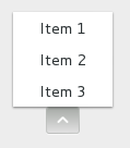
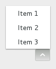
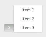
| | start | center | end |
| - | --- | --- | --- |
| down | 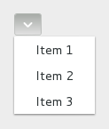 |
|  |
|  |
| up |
|
| up | 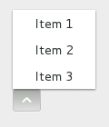 |
|  |
|  |
| left |
|
| left | 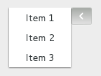 |
| 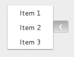 |
| 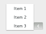 |
| right |
|
| right | 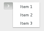 |
| 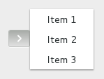 |
|  |
|
CSS nodes
 menubutton
 ╰── button.toggle
     ╰── <content>
          ╰── [arrow]
GtkMenuButton has a single CSS node with name menubutton
which contains a button node with a .toggle style class.
If the button contains an icon, it will have the .image-button style class,
if it contains text, it will have .text-button style class. If an arrow is
visible in addition to an icon, text or a custom child, it will also have
.arrow-button style class.
Inside the toggle button content, there is an arrow node for
the indicator, which will carry one of the .none, .up, .down,
.left or .right style classes to indicate the direction that
the menu will appear in. The CSS is expected to provide a suitable
image for each of these cases using the -gtk-icon-source property.
Optionally, the menubutton node can carry the .circular style class
to request a round appearance.
Accessibility
GtkMenuButton uses the Gtk.AccessibleRole.button role.
-
Nested Class Summary
Nested ClassesModifier and TypeClassDescriptionstatic interfaceFunctional interface declaration of theActivateCallbackcallback.static classMenuButton.Builder<B extends MenuButton.Builder<B>>Inner class implementing a builder pattern to construct a GObject with properties.Nested classes/interfaces inherited from class org.gnome.gtk.Widget
Widget.DestroyCallback, Widget.DirectionChangedCallback, Widget.HideCallback, Widget.KeynavFailedCallback, Widget.MapCallback, Widget.MnemonicActivateCallback, Widget.MoveFocusCallback, Widget.QueryTooltipCallback, Widget.RealizeCallback, Widget.ShowCallback, Widget.StateFlagsChangedCallback, Widget.UnmapCallback, Widget.UnrealizeCallback, Widget.Widget$Impl, Widget.WidgetClassNested classes/interfaces inherited from class org.gnome.gobject.InitiallyUnowned
InitiallyUnowned.InitiallyUnownedClassNested classes/interfaces inherited from class org.gnome.gobject.GObject
GObject.NotifyCallback, GObject.ObjectClassNested classes/interfaces inherited from interface org.gnome.gtk.Accessible
Accessible.Accessible$Impl, Accessible.AccessibleInterfaceNested classes/interfaces inherited from interface org.gnome.gtk.Buildable
Buildable.Buildable$Impl, Buildable.BuildableIfaceNested classes/interfaces inherited from interface org.gnome.gtk.ConstraintTarget
ConstraintTarget.ConstraintTarget$Impl, ConstraintTarget.ConstraintTargetInterface -
Constructor Summary
ConstructorsConstructorDescriptionCreates a new MenuButton.MenuButton(MemorySegment address) Create a MenuButton proxy instance for the provided memory address. -
Method Summary
Modifier and TypeMethodDescriptionprotected MenuButtonasParent()Returns this instance as if it were its parent type.static MenuButton.Builder<? extends MenuButton.Builder> builder()AMenuButton.Builderobject constructs aMenuButtonwith the specified properties.voidEmits the "activate" signal.booleanReturns whether the menu button is active.booleanGets whether to show a dropdown arrow even when using an icon or a custom child.Returns the direction the popup will be pointing at when popped up.booleanRetrieves whether the button can be smaller than the natural size of its contents.@Nullable WidgetgetChild()Gets the child widget ofmenuButton.booleanReturns whether the button has a frame.@Nullable StringGets the name of the icon shown in the button.@Nullable StringgetLabel()Gets the label shown in the buttonstatic MemoryLayoutThe memory layout of the native struct.@Nullable MenuModelReturns theGMenuModelused to generate the popup.@Nullable PopoverReturns theGtkPopoverthat pops out of the button.booleanReturns whether the menu button acts as a primary menu.static @Nullable TypegetType()Get the GType of the MenuButton classbooleanReturns whether an embedded underline in the text indicates a mnemonic.onActivate(MenuButton.ActivateCallback handler) Emitted to when the menu button is activated.voidpopdown()Dismiss the menu.voidpopup()Pop up the menu.voidsetActive(boolean active) Sets whether the menu button is active.voidsetAlwaysShowArrow(boolean alwaysShowArrow) Sets whether to show a dropdown arrow even when using an icon or a custom child.voidsetCanShrink(boolean canShrink) Sets whether the button size can be smaller than the natural size of its contents.voidSets the child widget ofmenuButton.voidsetCreatePopupFunc(@Nullable MenuButtonCreatePopupFunc func) Setsfuncto be called when a popup is about to be shown.voidsetDirection(ArrowType direction) Sets the direction in which the popup will be popped up.voidsetHasFrame(boolean hasFrame) Sets the style of the button.voidsetIconName(String iconName) Sets the name of an icon to show inside the menu button.voidSets the label to show inside the menu button.voidsetMenuModel(@Nullable MenuModel menuModel) Sets theGMenuModelfrom which the popup will be constructed.voidsetPopover(@Nullable Popover popover) Sets theGtkPopoverthat will be popped up when the this MenuButton is clicked.voidsetPrimary(boolean primary) Sets whether menu button acts as a primary menu.voidsetUseUnderline(boolean useUnderline) If true, an underline in the text indicates a mnemonic.Methods inherited from class org.gnome.gtk.Widget
actionSetEnabled, activateActionIfExists, activateDefault, activateWidget, addController, addCssClass, addMnemonicLabel, addTickCallback, allocate, childFocus, computeBounds, computeExpand, computeExpand, computePoint, computeTransform, contains, createPangoContext, createPangoLayout, cssChanged, directionChanged, disposeTemplate, dragCheckThreshold, emitDestroy, emitDirectionChanged, emitHide, emitKeynavFailed, emitMap, emitMnemonicActivate, emitMoveFocus, emitQueryTooltip, emitRealize, emitShow, emitStateFlagsChanged, emitUnmap, emitUnrealize, errorBell, focus, getAllocatedBaseline, getAllocatedHeight, getAllocatedWidth, getAllocation, getAncestor, getBaseline, getCanFocus, getCanTarget, getChildVisible, getClipboard, getColor, getCssClasses, getCssName, getCursor, getDefaultDirection, getDirection, getDisplay, getFirstChild, getFocusable, getFocusChild, getFocusOnClick, getFontMap, getFontOptions, getFrameClock, getHalign, getHasTooltip, getHeight, getHexpand, getHexpandSet, getLastChild, getLayoutManager, getLimitEvents, getMapped, getMarginBottom, getMarginEnd, getMarginStart, getMarginTop, getName, getNative, getNextSibling, getOpacity, getOverflow, getPangoContext, getParent, getPreferredSize, getPrevSibling, getPrimaryClipboard, getRealized, getReceivesDefault, getRequestMode, getRoot, getScaleFactor, getSensitive, getSettings, getSize, getSizeRequest, getStateFlags, getStyleContext, getTemplateChild, getTooltipMarkup, getTooltipText, getValign, getVexpand, getVexpandSet, getVisible, getWidth, grabFocus, hasCssClass, hasDefault, hasFocus, hasVisibleFocus, hide, inDestruction, initTemplate, insertActionGroup, insertAfter, insertBefore, isAncestor, isDrawable, isFocus, isSensitive, isVisible, keynavFailed, listMnemonicLabels, map, measure, mnemonicActivate, moveFocus, observeChildren, observeControllers, onDestroy, onDirectionChanged, onHide, onKeynavFailed, onMap, onMnemonicActivate, onMoveFocus, onQueryTooltip, onRealize, onShow, onStateFlagsChanged, onUnmap, onUnrealize, pick, pick, queryTooltip, queueAllocate, queueDraw, queueResize, realize, removeController, removeCssClass, removeMnemonicLabel, removeTickCallback, root, setCanFocus, setCanTarget, setChildVisible, setCssClasses, setCursor, setCursorFromName, setDefaultDirection, setDirection, setFocusable, setFocusChild, setFocusOnClick, setFontMap, setFontOptions, setHalign, setHasTooltip, setHexpand, setHexpandSet, setLayoutManager, setLimitEvents, setMarginBottom, setMarginEnd, setMarginStart, setMarginTop, setName, setOpacity, setOverflow, setParent, setReceivesDefault, setSensitive, setSizeRequest, setStateFlags, setStateFlags, setTooltipMarkup, setTooltipText, setValign, setVexpand, setVexpandSet, setVisible, shouldLayout, show, sizeAllocate, sizeAllocate, snapshot, snapshotChild, stateFlagsChanged, systemSettingChanged, translateCoordinates, triggerTooltipQuery, unmap, unparent, unrealize, unroot, unsetStateFlags, unsetStateFlagsMethods inherited from class org.gnome.gobject.GObject
addToggleRef, addWeakPointer, bindProperty, bindProperty, bindProperty, bindPropertyFull, bindPropertyFull, bindPropertyWithClosures, bindPropertyWithClosures, compatControl, connect, connect, connect, constructed, disconnect, dispatchPropertiesChanged, dispose, dupData, dupQdata, emit, emitNotify, finalize_, forceFloating, freezeNotify, get, getData, getProperty, getProperty, getProperty, getQdata, getv, interfaceFindProperty, interfaceInstallProperty, interfaceListProperties, isFloating, newInstance, newInstance, newv, notify, notify, notifyByPspec, onNotify, ref, refSink, removeToggleRef, removeWeakPointer, replaceData, replaceQdata, runDispose, set, setData, setDataFull, setProperty, setProperty, setProperty, setQdata, setQdataFull, setv, stealData, stealQdata, takeRef, thawNotify, unref, watchClosure, weakRef, weakUnref, withPropertiesMethods inherited from class org.gnome.gobject.TypeInstance
callParent, callParent, cast, getPrivate, readGClass, writeGClassMethods inherited from class org.javagi.base.ProxyInstance
equals, handle, hashCodeMethods inherited from class java.lang.Object
clone, finalize, getClass, notify, notifyAll, toString, wait, wait, waitMethods inherited from interface org.gnome.gtk.Accessible
announce, getAccessibleParent, getAccessibleRole, getAtContext, getBounds, getFirstAccessibleChild, getNextAccessibleSibling, getPlatformState, resetProperty, resetRelation, resetState, setAccessibleParent, updateNextAccessibleSibling, updatePlatformState, updateProperty, updateRelation, updateStateMethods inherited from interface org.gnome.gtk.Buildable
getBuildableId
-
Constructor Details
-
MenuButton
Create a MenuButton proxy instance for the provided memory address.- Parameters:
address- the memory address of the native object
-
MenuButton
public MenuButton()Creates a new MenuButton.
-
-
Method Details
-
getType
-
getMemoryLayout
The memory layout of the native struct.- Returns:
- the memory layout
-
asParent
Returns this instance as if it were its parent type. This is mostly synonymous to the Javasuperkeyword, but will set the native typeclass function pointers to the parent type. When overriding a native virtual method in Java, "chaining up" withsuper.methodName()doesn't work, because it invokes the overridden function pointer again. To chain up, callasParent().methodName(). This will call the native function pointer of this virtual method in the typeclass of the parent type. -
getActive
public boolean getActive()Returns whether the menu button is active.- Returns:
- TRUE if the button is active
- Since:
- 4.10
-
getAlwaysShowArrow
public boolean getAlwaysShowArrow()Gets whether to show a dropdown arrow even when using an icon or a custom child.- Returns:
- whether to show a dropdown arrow even when using an icon or a custom child.
- Since:
- 4.4
-
getCanShrink
public boolean getCanShrink()Retrieves whether the button can be smaller than the natural size of its contents.- Returns:
- true if the button can shrink, and false otherwise
- Since:
- 4.12
-
getChild
Gets the child widget ofmenuButton.- Returns:
- the child widget of this MenuButton
- Since:
- 4.6
-
getArrowDirection
Returns the direction the popup will be pointing at when popped up.- Returns:
- a
GtkArrowTypevalue
-
getHasFrame
public boolean getHasFrame()Returns whether the button has a frame.- Returns:
trueif the button has a frame
-
getIconName
Gets the name of the icon shown in the button.- Returns:
- the name of the icon shown in the button
-
getLabel
Gets the label shown in the button- Returns:
- the label shown in the button
-
getMenuModel
Returns theGMenuModelused to generate the popup.- Returns:
- a
GMenuModel
-
getPopover
Returns theGtkPopoverthat pops out of the button.If the button is not using a
GtkPopover, this function returnsnull.- Returns:
- a
GtkPopoverornull
-
getPrimary
public boolean getPrimary()Returns whether the menu button acts as a primary menu.- Returns:
trueif the button is a primary menu- Since:
- 4.4
-
getUseUnderline
public boolean getUseUnderline()Returns whether an embedded underline in the text indicates a mnemonic.- Returns:
truewhether an embedded underline in the text indicates the mnemonic accelerator keys.
-
popdown
public void popdown()Dismiss the menu. -
popup
public void popup()Pop up the menu. -
setActive
public void setActive(boolean active) Sets whether the menu button is active.- Parameters:
active- whether the menu button is active- Since:
- 4.10
-
setAlwaysShowArrow
public void setAlwaysShowArrow(boolean alwaysShowArrow) Sets whether to show a dropdown arrow even when using an icon or a custom child.- Parameters:
alwaysShowArrow- whether to show a dropdown arrow even when using an icon or a custom child- Since:
- 4.4
-
setCanShrink
public void setCanShrink(boolean canShrink) Sets whether the button size can be smaller than the natural size of its contents.For text buttons, setting
canShrinkto true will ellipsize the label.For icon buttons, this function has no effect.
- Parameters:
canShrink- whether the button can shrink- Since:
- 4.12
-
setChild
Sets the child widget ofmenuButton.Setting a child resets
Gtk.MenuButton:labelandGtk.MenuButton:icon-name.If
Gtk.MenuButton:always-show-arrowis set toTRUEandGtk.MenuButton:directionis notGTK_ARROW_NONE, a dropdown arrow will be shown next to the child.- Parameters:
child- the child widget- Since:
- 4.6
-
setCreatePopupFunc
Setsfuncto be called when a popup is about to be shown.funcshould use one ofto set a popup for
menuButton.Iffuncis non-null, this MenuButton will always be sensitive.Using this function will not reset the menu widget attached to
menuButton.Instead, this can be done manually infunc.- Parameters:
func- function to call when a popup is about to be shown, but none has been provided via other means, ornullto reset to default behavior
-
setDirection
Sets the direction in which the popup will be popped up.If the button is automatically populated with an arrow icon, its direction will be changed to match.
If the does not fit in the available space in the given direction, GTK will its best to keep it inside the screen and fully visible.
If you pass
ArrowType.NONEfor adirection,the popup will behave as if you passedArrowType.DOWN(although you won’t see any arrows).- Parameters:
direction- aGtkArrowType
-
setHasFrame
public void setHasFrame(boolean hasFrame) Sets the style of the button.- Parameters:
hasFrame- whether the button should have a visible frame
-
setIconName
Sets the name of an icon to show inside the menu button.Setting icon name resets
Gtk.MenuButton:labelandGtk.MenuButton:child.If
Gtk.MenuButton:always-show-arrowis set toTRUEandGtk.MenuButton:directionis notGTK_ARROW_NONE, a dropdown arrow will be shown next to the icon.- Parameters:
iconName- the icon name
-
setLabel
Sets the label to show inside the menu button.Setting a label resets
Gtk.MenuButton:icon-nameandGtk.MenuButton:child.If
Gtk.MenuButton:directionis notGTK_ARROW_NONE, a dropdown arrow will be shown next to the label.- Parameters:
label- the label
-
setMenuModel
Sets theGMenuModelfrom which the popup will be constructed.If
menuModelisnull, the button is disabled.A
Popoverwill be created from the menu model withPopoverMenu.fromModel(org.gnome.gio.MenuModel). Actions will be connected as documented for this function.If
Gtk.MenuButton:popoveris already set, it will be dissociated from themenuButton,and the property is set tonull.- Parameters:
menuModel- aGMenuModel, ornullto unset and disable the button
-
setPopover
Sets theGtkPopoverthat will be popped up when the this MenuButton is clicked.If
popoverisnull, the button is disabled.If
Gtk.MenuButton:menu-modelis set, the menu model is dissociated from themenuButton,and the property is set tonull.- Parameters:
popover- aGtkPopover, ornullto unset and disable the button
-
setPrimary
public void setPrimary(boolean primary) Sets whether menu button acts as a primary menu.Primary menus can be opened with the
F10key.- Parameters:
primary- whether the menubutton should act as a primary menu- Since:
- 4.4
-
setUseUnderline
public void setUseUnderline(boolean useUnderline) If true, an underline in the text indicates a mnemonic.- Parameters:
useUnderline-trueif underlines in the text indicate mnemonics
-
onActivate
public SignalConnection<MenuButton.ActivateCallback> onActivate(MenuButton.ActivateCallback handler) Emitted to when the menu button is activated.The
::activatesignal onGtkMenuButtonis an action signal and emitting it causes the button to pop up its menu.- Parameters:
handler- the signal handler- Returns:
- a signal handler ID to keep track of the signal connection
- Since:
- 4.4
- See Also:
-
emitActivate
public void emitActivate()Emits the "activate" signal. SeeonActivate(org.gnome.gtk.MenuButton.ActivateCallback). -
builder
AMenuButton.Builderobject constructs aMenuButtonwith the specified properties. Use the variousset...()methods to set properties, and finish construction withMenuButton.Builder.build().- Returns:
- the builder object
-